You went to Wikipedia to read about the Tunguska event. Three hours later you are reading about Nikola Tesla, then Wardenclyffe Tower, then Long Island, then the Montauk Project, and now you are somehow on Philadelphia Experiment and you have no idea how you got here. Your tab bar is a graveyard of half-read articles. Your browser is wheezing. And you still do not know what caused the Tunguska explosion.
This is not a discipline problem. It is not a focus problem. It is a physics problem. Wikipedia is the most link-dense website on the internet. Every paragraph contains three to five blue links. Every link is a promise of context. And your browser treats every one of those links as a commitment — a new tab, a new process, a new context switch.
You are not falling down a rabbit hole because you are weak. You are falling because the ground is made of trapdoors.
Why Wikipedia Is Built to Break Your Brain
Wikipedia is not designed for linear reading. It is designed for networked discovery. The ideal Wikipedia reader does not read one article. They read ten, in a branching pattern, cross-referencing concepts as they go. The site assumes you will click away mid-sentence to check a related term, then click again, then again.
The problem is that browsers are not designed for networked discovery. They are designed for linear navigation. One page. Then another page. Then another. The back button is a lifeline, not a tool. When you are five articles deep, clicking back five times to return to your origin is not a workflow. It is an admission of defeat.
And the tab bar? It becomes a memory palace you cannot read. "Tunguska event," "Nikola Tesla," "Wardenclyffe Tower," "Long Island," "Montauk Project" — each tab is a bookmark of a thought you had twenty minutes ago. But the tab titles do not tell you why you opened them. They do not tell you what question you were trying to answer. They are just labels for mental states you no longer occupy.
The Four Ways Wikipedia Research Dies
Here is how a typical Wikipedia research session collapses. See if any of these feel familiar.
Death #1: The "Quick Check" Cascade
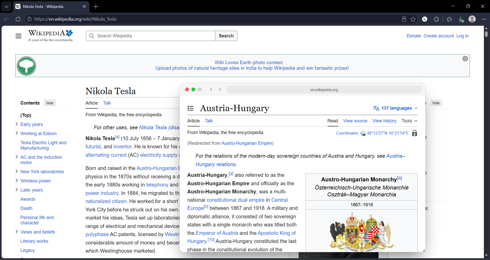
You are reading about the Roman Empire. You see a link to "Praetorian Guard." You think, "I should remember what that is." You open it in a new tab. While reading that, you see "Sejanus." New tab. Then "Tiberius." New tab. Then "Capri." New tab. Then "Blue Grotto." New tab. You now have six tabs about Roman history and one about a sea cave in Italy. You have forgotten the original article. You close them all in disgust and go make coffee.
Death #2: The Citation Archaeology Dig
You are writing a paper. You need to verify a claim in a Wikipedia article. You scroll to the references. You click the first source. It is a paywalled journal. You click the second. It is a dead link. You click the third. It is a 400-page PDF. You open it. Your browser freezes. You force-quit. You have lost the Wikipedia article, your notes, and your will to live.
Death #3: The Disambiguation Spiral
You click a link to "Mercury." Is it the planet? The element? The Roman god? The car company? The record label? The disambiguation page has 47 entries. You open three of them in new tabs to compare. Now you are reading about Freddie Mercury, the planet Mercury, and the chemical properties of mercury. Your research on the solar system has become a research on a Queen frontman. This is not progress.
Death #4: The "I Will Read This Later" Hoard
You are disciplined. You know you cannot read every link. So you open the interesting ones in new tabs and tell yourself you will "come back to them." You now have 23 tabs. You will never come back to them. You will close them in a panic three days later, feeling guilty about the knowledge you "almost" acquired. This is not research. This is digital hoarding with a scholarly veneer.
How GoPeek Changes the Physics
GoPeek does not fix Wikipedia. Wikipedia is fine. GoPeek fixes the browser's response to Wikipedia. It turns every blue link from a trapdoor into a window. You can look through it without falling through it.
Hover, Do Not Commit
When you hold Shift and hover a Wikipedia link, a live preview opens instantly. You see the article. You read the first paragraph. You realize it is not what you needed. You close it. Total time elapsed: 4 seconds. Tabs opened: zero. Context lost: zero.
This is the difference between auditioning a link and committing to it. Wikipedia links should be auditions. Most of them are context, not destination. You do not need to read the entire article on "Byzantine architecture" to understand a passing reference in the "Hagia Sophia" article. You need a 10-second summary. GoPeek gives you that without the tab.
Sidebar Mode: The Reference Desk
Sometimes you do need to read the related article in depth. You are writing about the Tunguska event and you need to understand the state of meteor air burst research in 1908. You need the related article open, but you also need your original article visible.
Drag the GoPeek preview to the edge of your screen. It snaps into sidebar mode — a resizable split-screen panel. Your original article stays on the left. The related article stays on the right. You can scroll both independently. You can copy text from the preview and paste it into your notes. You are not navigating anymore. You are working.
Bubble Minimize: The Floating Footnote
Some links are not for now. They are for later in the article. You see a reference to "Kulik's 1927 expedition" and you know you will need the details when you reach the "Investigations" section. But you are still in the "Event" section. You do not want to lose the link, but you do not want to read it now.
Double-click the GoPeek header. It collapses into a floating bubble — a small circle with the Wikipedia favicon that sits on your screen. It is not a tab. It is not in your tab bar. It is a visual reminder that you have a source waiting. When you reach the "Investigations" section, you click the bubble. It expands. You read it. You close it. Your workflow is intact.
Search Selection: The "What Is This Word?" Fix
Wikipedia articles are dense with jargon. "Magnetic reconnection." "Alfvén wave." "Magnetohydrodynamics." You do not need to open a new tab to search each term. Highlight it, hold Shift, and GoPeek opens a Google search preview instantly. You read the definition, close the preview, and your eyes are still on the same sentence. No context switch. No tab. No lost thread.
Wikipedia Research: With vs. Without GoPeek
| Task | Stock Browser | With GoPeek |
|---|---|---|
| Check a related concept | New tab → read → forget original article → 5 tabs deep | Shift + hover → preview → read → close → still on original page |
| Verify a citation | Click reference → dead link / paywall → browser freeze → force quit | Hover reference link → preview source → verify → close → no risk |
| Compare disambiguation options | Open 3 tabs → Alt-Tab between them → lose track of which is which | Multi-Peek → 3 previews side by side → compare instantly |
| Save a link for later | Open tab → hoard in tab bar → panic close later → lose it | Bubble minimize → floating orb → reopen when needed → no tab clutter |
| Look up jargon | Copy term → new tab → search → read → close → scroll back to sentence | Highlight term → Shift+hover → search preview → close in 5 seconds |
| End of session | 20 tabs open → close one by one → feel guilty about unread articles | Close previews as you finish → zero tab guilt |
Why Wikipedia Is the Perfect GoPeek Use Case
Most websites have one or two links per page. Wikipedia has forty. And unlike a blog post, where links are editorial choices meant to send you away, Wikipedia links are structural. They are the connective tissue of human knowledge. You cannot read Wikipedia without clicking them. The site assumes you will.
This means Wikipedia research is inherently speculative. You are not following a linear path. You are exploring a network. You need to peek at nodes, evaluate their relevance, and either pursue them or return to your origin. A browser built for linear navigation is the wrong tool for networked exploration. It is like using a highway car to navigate a jungle.
GoPeek is built for networked exploration. Every link is a glance, not a commitment. Every detour is reversible. Every source is accessible without displacement. You are not fighting the architecture of the web anymore. You are moving through it the way it was meant to be moved through: fluidly, curiously, without penalty.
The Wikipedia Power Stack
GoPeek is the anchor, but here is the full stack for serious Wikipedia research:
- GoPeek: Handle every blue link without a tab switch. This is your primary navigation layer.
- uBlock Origin Lite: Wikipedia does not have ads, but it has donation banners that take up half the screen for three months a year. Strip them.
- Dark Reader: Wikipedia is blindingly white. Save your eyes during 3-hour research sessions.
- Zotero Connector: When you find a citation worth saving, capture it with one click. Auto-metadata. No manual entry.
Four extensions. That is all. Old Reddit users have their stack. Wikipedia researchers have theirs. This is it.
The Bottom Line
Wikipedia is one of humanity's greatest achievements. It is also one of the most hostile interfaces for focused research ever built. Not because it is badly designed — it is brilliantly designed for exploration. But exploration and focus are different things. Wikipedia wants you to explore. Your work requires you to focus.
You cannot change Wikipedia. But you can change how your browser handles it. GoPeek does not redesign the site. It redesigns the cost of engaging with it. Every link becomes a hover. Every detour becomes reversible. Every article becomes a glance, not a commitment.
The next time you go to Wikipedia to read about the Tunguska event, you will actually read about the Tunguska event. And if you end up on the Philadelphia Experiment, it will be because you chose to go there — not because your browser dragged you through a dozen tabs and left you stranded.